DynamicRanger's ThinHUD v3
The guiding principle behind my HUD's design is visual efficiency--I like sitting in a cockpit, so I need to fit as much info as possible on the screen without obscructing my view anymore than a cockpit already does. Tracking indicators are completely square and very slim; I got the idea from Wing Commander III. Crucially, non-targeted tracking indicators are much smaller than on most other HUDs, greatly reducing screen clutter. Enemy contacts are displayed with unique targeting crosshairs to further distinguish them from other targets. Overall, I've tried to remove unnecessary detailing and redundant indicators (IDS/Inertial, MDTS status, etc.). I also tried to increase contrast and crispness in the HUD elements, so info is visible against any background.
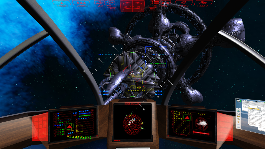

Toolbar and compass
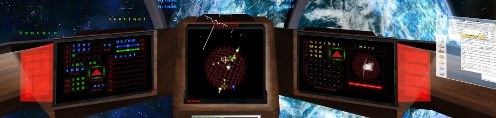
Dashboard
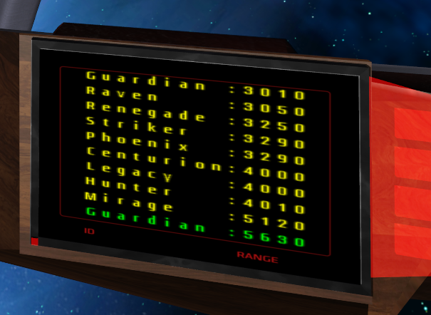
Target List
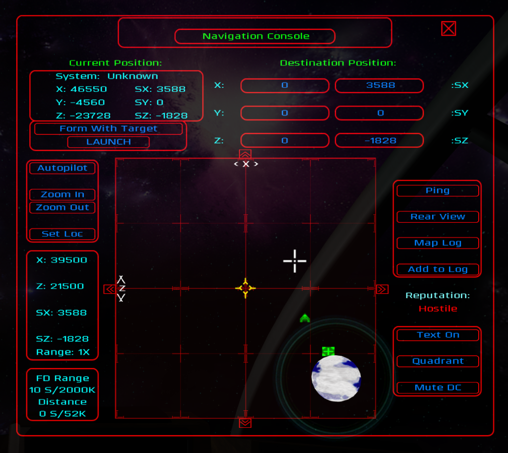
Navigation screen
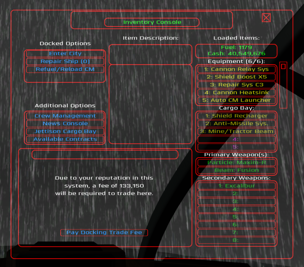
Inventory screen
(Mostly) Original assets include:
Gunsight (with thanks to Malix and onehand for bringing it to my attention)
Main toolbar and info screens
Tracking and targeting brackets
Lead indicators
Radial target pointers
Strafe indicator
Radar blips
Nav point indicator
Incoming missile indicator and vector arrows
On-screen alerts
Shield arc bars
Radar sphere
Compass strip
Inventory and nav screens
Selection buttons
Mouse cursors
Miscellaneous icons (sub-system targeting, some map icons, etc.)
[Edited on 11-28-2012 by DynamicRanger]