Page 1 of 1
[EL] - Darker and Rounded Buttons...
Posted: Fri Dec 02, 2016 10:32 pm
by Vice
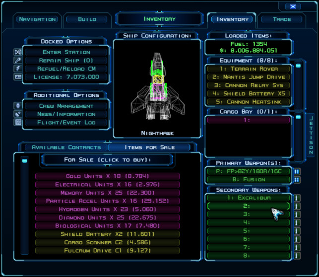
Here are some alternate buttons and scroll bars providing a softer, rounded look with highlight brackets for mouseover. To install, simply place the folders in the zip below within the game's install folder (Program Files (x86)\Steam\SteamApps\common\Evochron Legacy for Steam or \sw3dg\EvochronLegacy for the direct download version).
These custom images will also provide you with a template from which to modify the buttons for your own designs using a complete image set.
Download link:
http://www.starwraith.com/evochronlegac ... ttons1.zip
Re: EL - Darker and Rounded Buttons...
Posted: Sat Dec 03, 2016 5:52 am
by Marvin

Do you mean the tab labels at the top of the menu?
Re: EL - Darker and Rounded Buttons...
Posted: Sat Dec 03, 2016 6:28 am
by Vice
All buttons and scrollbars in the game. For example, the green list of weapons on the lower right. The buttons are much darker and have rounded corners. The mouseover effect displays bright brackets when highlighted.
Re: EL - Darker and Rounded Buttons...
Posted: Sat Dec 03, 2016 7:17 pm
by Marvin
I'll test 'em but, if they look really cool, then you might want to consider making them the default. (Not everyone reads this forum or wants to try installing mods.)
Re: EL - Darker and Rounded Buttons...
Posted: Sat Dec 03, 2016 7:23 pm
by Vice
I have considered these and others as possible new default options. However, the lack of defined lines along click ranges (top and bottom), less contrast between buttons and backgrounds, along with other differences may not make them a better option. The current buttons have well defined edges, side bars, and contrast clarity. But options like this are a way to gauge what others think in the meantime, should they or something similar be a popular direction to go. And if not, they can still be available to those who might want to use them or even use them as a template to design their own replacements they may prefer.
Re: EL - Darker and Rounded Buttons...
Posted: Tue Dec 06, 2016 5:40 pm
by DaveK
Hmmm ... I'm in a quandary! I think the new version looks good and feels like it belongs in a real display system, but the old style is a bit clearer for my old eyesight. I'll try them both out in game and take comparable screenies as well.
Sorry for the low profile ... 2016 is proving to be a bugger of a year! I've now knackered the cartilage in my right knee and so I'm having to wear a chunky ski knee support and can only sit with a bent leg for a relatively limited time in one session

To add insult to injury I can't go biking either.
Still, I'm still just about able to keep up with the stream of new stuff in game!

Re: EL - Darker and Rounded Buttons...
Posted: Tue Dec 06, 2016 6:38 pm
by Marvin
I still think it should be the default for tab labels. The menu tabs have rounded edges so rounded labels makes sense.
Re: [EL] - Darker and Rounded Buttons...
Posted: Tue Dec 06, 2016 9:39 pm
by Vice
Here's a rounded set using the original default color levels and click range divisions:
http://www.starwraith.com/forum/viewtop ... 21&t=12931
Re: [EL] - Darker and Rounded Buttons...
Posted: Mon Dec 26, 2016 12:42 pm
by jerrycheng
wonderfull..