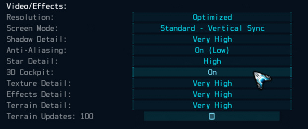
Based on feedback, I am considering changing the in-game buttons slightly to incorporate a solid bar type effect, rather than the upper/lower bars with a faded center. Attached are '\hud' and '\menu' folders in a ZIP with replacement images for this alternate approach (drop the folders in the game's '\media' folder to install and test). Please give them a try and let me know what you think. Do they make the UI looks cleaner and less cluttered? Or is the change too minimal to make much of a difference? Or do the original images look more sophisticated/defined/better?
https://www.starwraith.com/evochronlega ... uttons.zip
Here are some screenshot showing the old buttons compared to the new design in the Options menu.
First, the current design:
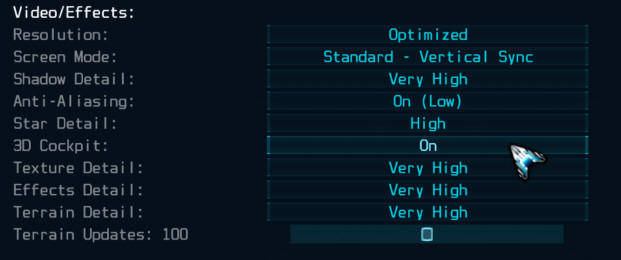
And the new design being considered: